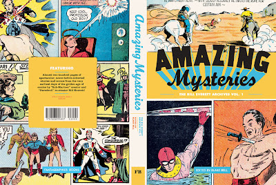
Not as well known to the general public as some Golden Age comics creators, Bill Everett was there from the very beginning of Marvel...or to be more precise, just BEFORE its beginning when he created THE SUB-MARINER for MOTION PICTURE FUNNIES WEEKLY # 1. Unlike many who started crude and got better, or others who started okay and became far too stylized to be enjoyable, Everett's art was pretty well developed right out of the gate and continued to improve until his death in the early seventies. To many, myself included, his best work ever was on a return to his creation, THE SUB-MARINER, just before the end.
This volume collects 36 covers and stories from the artist's earliest days in comics. Originally published by various companies, these feature fun but forgotten characters such as Amazing Man, The Conquerer, Music Master, Hydro Man and Dirk the Demon. Presented chronologically, one can witness Bill's design skills develop by leaps and bounds even as his storytelling skills just seem to have come naturally to him.
Compiled by Blake Bell, author of the still recent Bill Everett biography, who provides some insightful text and art samples throughout, fans of Golden Age comic books in general and key artists in particular have a treasure trove here similar to Vanguard's recent Wally Wood volume. Lots of fun, colorful stories with some of the best artwork of the late 1930's and early 1940's.
Comics fans have long lionized Kirby, the EC artists and a few others. It's about time that Bill Everett was added to that list! I'm glad to see that "Vol.1" in the subtitle because that means Blake is already working on a follow-up. Like I said, Everett started strong and just kept getting better. I can't wait for more!


I'm with you on the cover. When I saw this a few days ago, I didn't immediately recognize it as Everett's work.
ReplyDeleteI do want to give the volume a tumble though. This early stuff by Everett shows how far ahead of his peers he was.
Rip Off
Everett had such a recognizable signature. I think I would have highlighted that on the cover rather than the mish-mosh of panels or even having to choose one image.
ReplyDelete